Throwdown with Bobby Flay Dossiers
During my senior year in college, Director Todd Broder asked if I'd be willing to do design work for Food Network's new show called Throwdown with Bobby Flay.
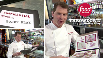
Based on the graphic style of the opening sequence, I designed, printed, and assembled the dossiers of Flay's competitors under tight deadlines, for the entire first season. He would flip through one at the start of every episode, reacting to the depicted competitor into the camera.
My dossiers became the template for the series. This is an outline of my basic process from the Wedding Cake episode, with snippets from other episodes below it.
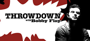
Existing title sequence graphics I used as a style guide
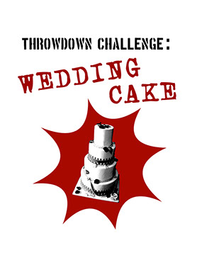
Dossier cover also used to introduce the
episode as an on screen graphic
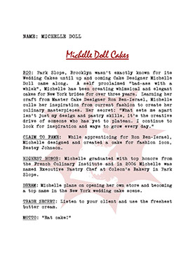
Competitor information page Bobby Flay
would read from to the camera
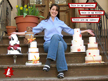
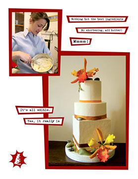
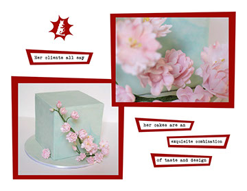
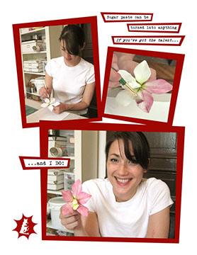
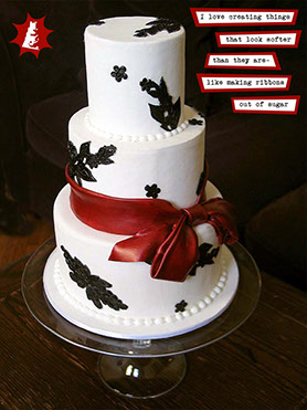
Pages from dossier
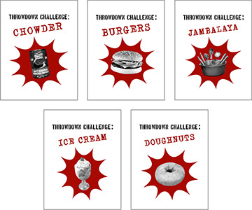
Various episode title pages from Season 1
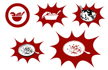
I decided to create a watermark/logo stamp for every page of a dossier, based on the episode theme. Here are the rounds of revision for the first episode (chowder), before the graphic style on the lower right became standard.
Dossier in action for Season 1, Episode 1: Chowder
Skip to @1:45 for dossier scene