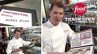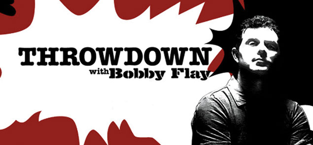
Existing title sequence graphics I used as a style guide

Dossier cover also used to introduce the episode
as an on screen graphic

Competitor information page Bobby Flay would
read from to the camera
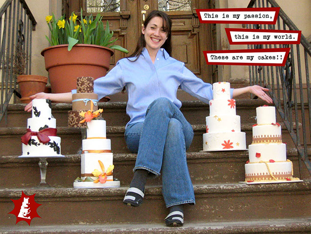
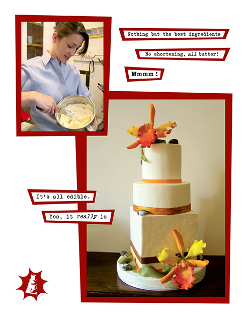
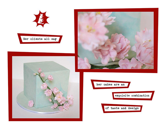
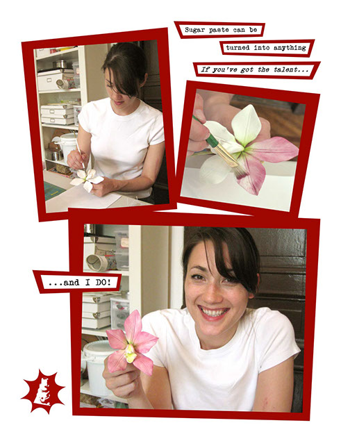
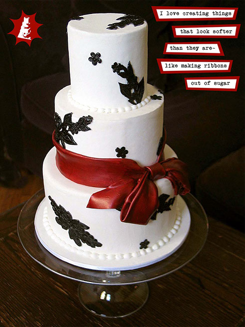
Pages from dossier
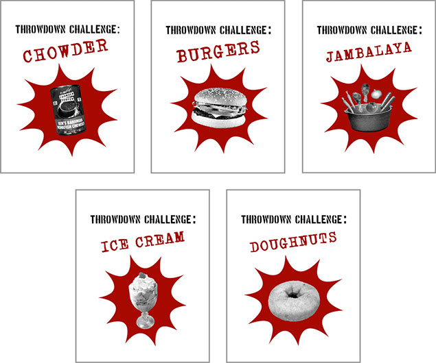
Various episode title pages from Season 1
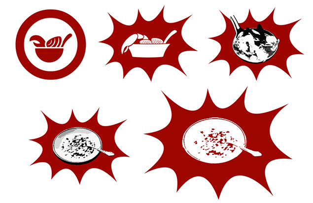
I decided to create a watermark/logo stamp for every page of a dossier, based on the episode theme. Here are the rounds of revision for the first episode (chowder), before the graphic style on the lower right became standard.
Dossier in action for Season 1, Episode 1: Chowder
Skip to @1:45 for dossier scene

LinkedIn Multimedia Design Work
2021 | Motion graphic template design from brand style guide, infographic, logo design with guidelines for use, and multiple sets of icons.
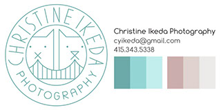
Christine Ikeda Photography
2014 | Logo design and branding for San Francisco professional photographer, Christine Ikeda.

PlayMoolah
2009-2011 | Designer/animator for this children's educational startup. I created some of the site's most essential animated UI components. Animated demos included.

Keepsafe Infographics
2018 | Keepsafe is a mobile privacy app startup. These infographics show statistics on protecting personal data and privacy concerns around online dating. Animated versions also included.
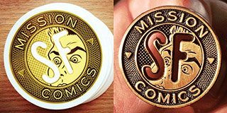
Mission Comics
2014 | Promotional design for this popular comic shop / art gallery in San Francisco's Mission District.

NickJr.com
2008 | Designer and animator of content, ads, and downloadable activities for Nick Jr.'s hit shows.
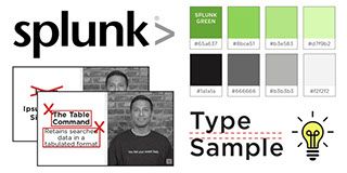
Splunk eLearning Style Guide
2016 | A comprehensive style guide I initiated, for the design and video editing processes of Splunk's eLearning videos.

Disney Interactive
2010-2012 | Marketing Designer at Disney Interactive's social gaming company, Playdom. I created promotional videos, products, designed ads and UI.
Publicis
2006-2008 | Art director for General Mills's Millsberry gaming site. The account was acquired to modernize and add life to its overall style.
Throwdown with Bobby Flay Dossiers
During my senior year in college, Director Todd Broder asked if I'd be willing to do design work for Food Network's new show called Throwdown with Bobby Flay.
Based on the graphic style of the opening sequence, I designed, printed, and assembled the dossiers of Flay's competitors under tight deadlines, for the entire first season. He would flip through one at the start of every episode, reacting to the depicted competitor into the camera.
My dossiers became the template for the series. This is an outline of my basic process from the Wedding Cake episode, with snippets from other episodes below it.
